How to Design a Contactless Vitals Kiosk for ADA Compliance
Contactless vitals kiosk ADA compliance design for medical device teams: accessibility dimensions, reach ranges, privacy, multimodal UX, and deployment standards.
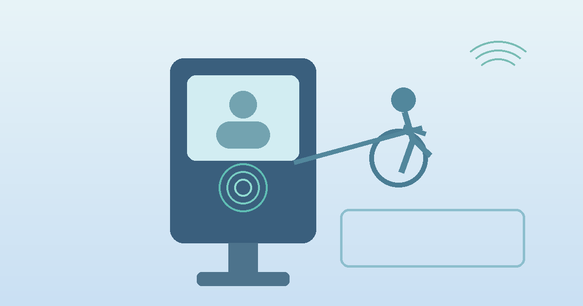
Contactless vitals kiosk ADA compliance design has moved from a nice-to-have to a core product requirement for device makers building self-service healthcare infrastructure. Hospitals, pharmacies, and clinic networks increasingly want kiosks that support independent use by wheelchair users, older adults, blind and low-vision patients, and people with limited dexterity. That changes the design brief. A kiosk is no longer just a camera, a screen, and a thermal printer in a metal enclosure. It is a physical interface, a digital workflow, and an accessibility system that has to work together under real-world conditions.
"Public access kiosks must be designed so that people with disabilities can use them independently and privately." — Jonathan Lazar, Brian Wentz, and Andrew Sears, Universal Access in the Information Society (2009)
Contactless Vitals Kiosk ADA Compliance Design Starts With Physical Access
The first mistake many teams make is treating accessibility as a software overlay. In practice, the enclosure geometry decides whether the kiosk is usable before the first screen even loads. The 2010 ADA Standards for Accessible Design set baseline expectations that still matter in 2026: clear floor space of 30 by 48 inches, accessible reach ranges that generally fall between 15 and 48 inches above the floor, and operable parts that can be used with one hand without tight grasping, pinching, or twisting.
For a contactless vitals kiosk, those rules shape camera placement, display tilt, card or ID scanner height, headphone jack location, and any optional accessories such as printers or badge readers. If the screen sits too high, the user may fit the wheelchair clearance zone but still fail the actual measurement flow because they cannot align their face with the camera guidance area. That sounds obvious. It gets missed all the time.
A good design target is not "technically reachable." It is comfortable, repeatable, and forgiving.
| Design area | ADA-oriented target | Why it matters in vitals kiosks |
|---|---|---|
| Clear floor space | 30" x 48" minimum | Allows frontal or parallel wheelchair approach |
| Reach range | Roughly 15" to 48" | Keeps touch targets, headphone jacks, and scanners usable |
| Operable parts | One-hand use, no tight grasping/pinching/twisting | Important for users with dexterity limitations |
| Knee/toe clearance | Required where forward approach is expected | Prevents enclosure base from blocking access |
| Screen angle | Readable from seated and standing positions | Reduces neck strain and camera misalignment |
| Audio access | Headphone jack or equivalent private audio path | Supports blind and low-vision users |
| Input alternatives | Touch plus tactile or nonvisual input path | Touch-only design excludes some users |
The hardware implication is straightforward: the kiosk should be designed around seated use first, then verified for standing use, not the other way around.
Why Contactless Measurement Helps ADA-Centered Kiosk Design
Contactless measurement changes the accessibility equation because it removes several failure points found in cuff-based or clip-based stations. Users do not have to thread an arm into a cuff, squeeze a finger probe, or hold a device in a precise orientation. The interaction can be reduced to positioning, consent, and stillness.
That does not make the kiosk automatically accessible. It does make accessibility more achievable.
Compared with contact-heavy stations, a contactless vitals kiosk usually offers:
- fewer required motor actions
- fewer hygiene steps between users
- less staff intervention during routine screening
- shorter sessions in high-throughput environments
- a cleaner path to seated measurement workflows
The key tradeoff is that camera-based workflows depend heavily on visual guidance unless teams build real multimodal support. That means audio prompts, tactile controls where needed, readable contrast, large touch targets, and error recovery that does not trap the user in a loop.
For that reason, the best embedded teams now think of accessibility and signal quality as related design problems. If a user cannot comfortably position themselves, your measurement quality suffers too.
A Comparison of Accessibility Approaches in Kiosk Architecture
| Approach | Accessibility strengths | Accessibility risks | Best fit |
|---|---|---|---|
| Touch-only standing kiosk | Simple enclosure, lower BOM | Excludes some wheelchair, blind, low-vision, and dexterity-limited users | Low-complexity nonclinical uses |
| Touch kiosk with seated geometry | Better physical access, better camera alignment for more users | Still weak for nonvisual navigation if touch is the only input | General outpatient and pharmacy deployments |
| Multimodal contactless kiosk | Supports seated use, audio guidance, privacy, and alternative input | Higher integration complexity | Healthcare and federally funded settings |
| Hybrid kiosk with staff-assist fallback | Covers more edge cases operationally | Can reduce privacy and independence if fallback becomes the norm | Assisted environments, not ideal as primary model |
This is where the 2024 HHS Section 504 final rule matters. HHS made clear that self-service kiosks in medical settings for federally funded entities must be usable by people with disabilities, either through accessible design or an alternative that offers equivalent access, confidentiality, and convenience. The timing matters too: compliance deadlines are approaching in 2026 and 2027 depending on organization size. For OEMs and kiosk manufacturers, that shifts accessibility from procurement preference to buying criterion.
The UX Layer: Accessibility Is Not Just About Dimensions
Physical compliance gets the kiosk into the room. User experience determines whether people can finish the session independently.
A 2021 study on self-serve kiosks for blind and partially sighted Canadians by Mahadeo Sukhai, Sam Petri, Carson Reynolds, Jaclin Whaley, and Michaela Knot found that 64.14% of participants encountered barriers and most needed human assistance to complete tasks. That point is easy to overlook in healthcare. Assistance may solve completion, but it can destroy privacy.
A 2023 paper in Applied Sciences by Yuryeon Lee, Sunyoung Park, Jaehyun Park, and Hyun K. Kim also drew a useful distinction: accessibility covers core functional access, while usability includes the psychological and interaction burdens that shape whether people actually want to use the kiosk. In other words, a kiosk can technically pass and still fail patients.
That is especially relevant for vitals capture. People may already feel exposed, rushed, or uncertain about what the device is measuring.
Design patterns that hold up better in the field include:
- one clear primary action per screen
- large on-screen instructions with plain language
- visual and spoken feedback that happen at the same time
- face-position guidance that works from seated eye lines
- countdowns that explain what is happening during capture
- an obvious restart path without staff intervention
- privacy prompts that explain what is and is not stored
If the workflow requires fine touch precision, complex branching, or hidden menus, it will underperform for many users long before formal audits begin.
Industry Applications for Accessible Contactless Vitals Kiosks
Hospital and outpatient check-in
Hospitals want pre-visit vitals capture without adding another bottleneck at reception. Accessible contactless kiosks can support broader patient independence, especially when paired with EHR-connected workflows and private audio output.
Pharmacy and retail clinic deployments
Retail environments benefit from seated-friendly, quick-turn interactions. That matters for older adults, mobility aid users, and anyone who may not tolerate long standing sessions. Related deployment patterns already show up in self-service health screening kiosks and pharmacy kiosk contactless screening.
Government-funded health systems
The compliance bar is rising faster here because Section 504 obligations intersect with procurement rules, risk management, and public access requirements. Accessibility gaps increasingly become purchasing blockers.
Senior living and assisted settings
Older adults often need lower physical strain, clearer text, better glare control, and simpler sequencing. Research on older adults using self-service kiosks, including more recent work on seated use and privacy partitions, suggests physical comfort can materially improve completion time and perceived workload.
Current Research and Evidence
The research base is not perfect, but it points in a consistent direction.
Jonathan Lazar, Brian Wentz, and Andrew Sears argued back in 2009 that kiosk accessibility needed unified guidance rather than fragmented assumptions. That argument aged well. The market spent years building touch-first kiosks and retrofitting accessibility later.
Sukhai and colleagues' 2021 work on blind and partially sighted kiosk users showed how often independent use breaks down when audio, tactile input, and clear instructions are missing.
Lee, Park, Park, and Kim in 2023 found that kiosk accessibility and usability should be evaluated together, not as separate checkboxes. Essential access without manageable interaction burden is not enough.
Research on older adults adds another practical layer. Recent user studies found that seating and privacy partitions can reduce workload and frustration, which matters for healthcare kiosks where users may already be stressed. That finding has direct hardware implications: enclosure layout, side shielding, and screen position are not cosmetic decisions.
The regulatory side has also become more concrete. HHS's 2024 Section 504 final rule explicitly addresses accessible self-service kiosks in medical settings. Meanwhile, the U.S. Access Board's kiosk rulemaking work continues to emphasize speech output, tactile input, operable parts, and clear floor space. Product teams do not need to wait for every downstream rule to finalize before designing better hardware.
The Future of Contactless Vitals Kiosk Accessibility
The next phase of kiosk design will likely move in three directions.
First, accessibility features will become part of the default hardware platform rather than optional add-ons. That means standard support for private audio, lower accessory placement, and seated-optimized camera geometry.
Second, multimodal guidance will get smarter. Instead of static arrows on a screen, kiosks will adapt prompts based on how the user approaches, whether the camera sees a seated posture, and whether the user needs slower pacing.
Third, procurement teams will ask tougher questions. Not just whether the kiosk is ADA compliant, but whether it preserves independence, confidentiality, and convenience across real patient populations. That is a higher bar, and honestly a better one.
For embedded device makers, this is good news. Accessibility-led design usually improves throughput, lowers abandonment, and reduces staff assist rates. It is one of the few areas where compliance and product quality often point in the same direction.
Frequently Asked Questions
What dimensions matter most in an ADA-compliant vitals kiosk?
The baseline physical requirements usually start with 30 by 48 inches of clear floor space and accessible reach ranges of about 15 to 48 inches. In practice, teams also need to validate knee clearance, camera sight lines, and seated readability of the screen.
Is a touch-only contactless kiosk enough for ADA compliance?
Usually not by itself. A touch-only interface can still exclude blind users, some low-vision users, and people with limited dexterity. Healthcare deployments increasingly need audio guidance, private speech output, and alternative input paths.
Does contactless measurement make kiosk accessibility easier?
Yes, in one important sense: it removes several difficult motor interactions tied to cuffs, probes, and clips. But it also raises the stakes for clear multimodal guidance because the session depends on positioning and comprehension.
Why does privacy matter in accessible kiosk design?
Because a system that only works with staff assistance may not offer equivalent access. In healthcare, needing another person to read the screen or complete the flow can undermine confidentiality even if the task eventually gets done.
A well-designed contactless vitals kiosk should work for more people with less friction, less staff rescue, and more privacy. That is where the market is heading. For teams building embedded measurement systems for clinical kiosks, Circadify's clinical kiosk integration work points to the kind of camera-first architecture now being adopted across accessible healthcare deployments.